Refreshing a Brand with Good Bones
First impressions are never wrong
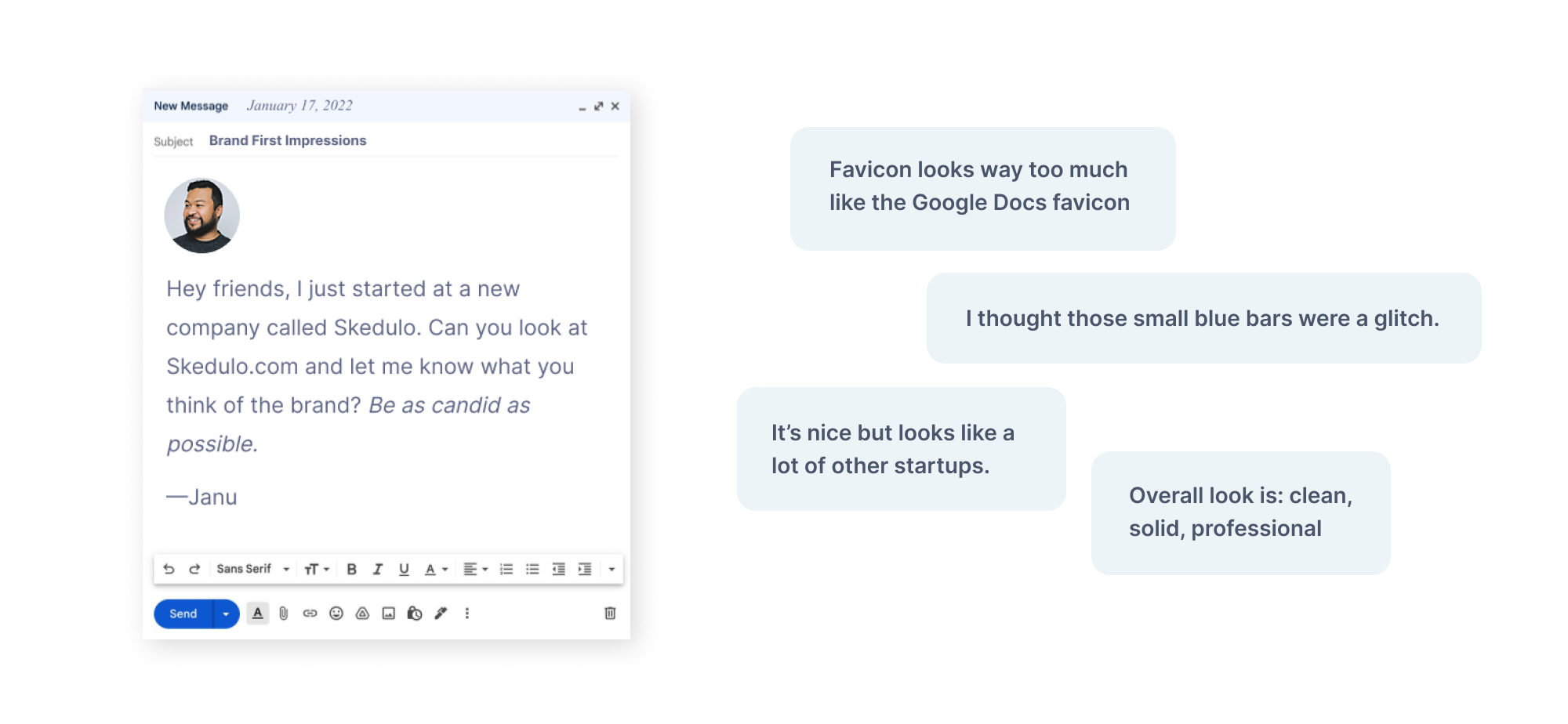
When it comes to evaluating brands, I believe first impressions are never wrong. When your brand is out in the wild—outside a context of a branding case study—people are going to think what they want to think. In many ways the underlying logic behind the branding doesn’t matter if intent doesn’t come through. Although there’s always a certain amount of subjectivity to how a brand is received there is no denying feedback patterns. Much like in UX design, if users keep clicking on the wrong button, then there’s something wrong with the design and not the user. So the first step I took when I joined Skedulo back in January was to ask a sampling of friends (a fair amount of non-designers included) to tell me what they thought of the brand after taking a minute to browse Skedulo.com. I wanted to see what repeated themes came up and overlay those with my own observations as someone with experience building successful brands in the B2B space.
Digging deeper
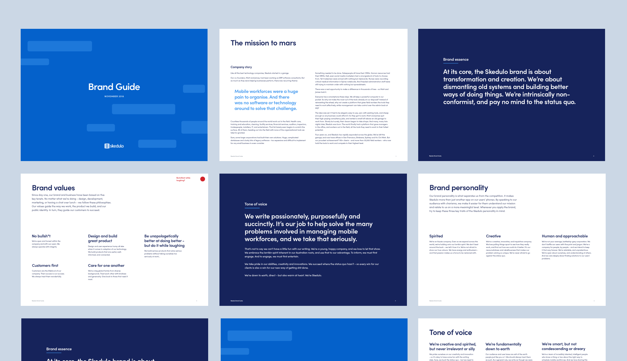
Taking a step back, one of the reasons I joined Skedulo was that I had a great conversation with our CEO, Matt Fairhurst during the interview process. Matt has a background in design and it was clear during our talk that he cared deeply about design and brand—while also being open to change if there were logical reasons for it. I had a feeling there had already been some underlying work done from a brand perspective so I began to collect and study available brand artifacts. I was pleasantly surprised that a lot of the thinking behind the brand—from values to tone of voice—were all very well thought-out, and most importantly, felt genuine to Skedulo.
A brand with good bones
I’m personally not a fan of just rebranding for the hell of it—and even if some level of rebranding is in order there’s always a question of ‘how much?’ If you’ve ever been involved in a house remodel, then you’d know that the job is going to be quite a bit easier if the building is structurally sound—which is exactly how I found the Skedulo brand. After digesting and synthesizing all the data points from both internal and external sources, it was clear that there was definitely room for improvement as far as execution—but the brand’s framework was structurally sound.
Modern “digital-first” branding
There’s a lot of traditions and conventions in the brand design space that’s been held over from a different time—or at least for different types of clients. For example, for most tech companies, 90% of your brand touch points are digital. If that’s the case, why would you confine your brand color to Pantone colors that are optimized for print? Doing an effective brand refresh meant effectively contextualizing the space your brand lives in.
01. Animation and kinetic potential
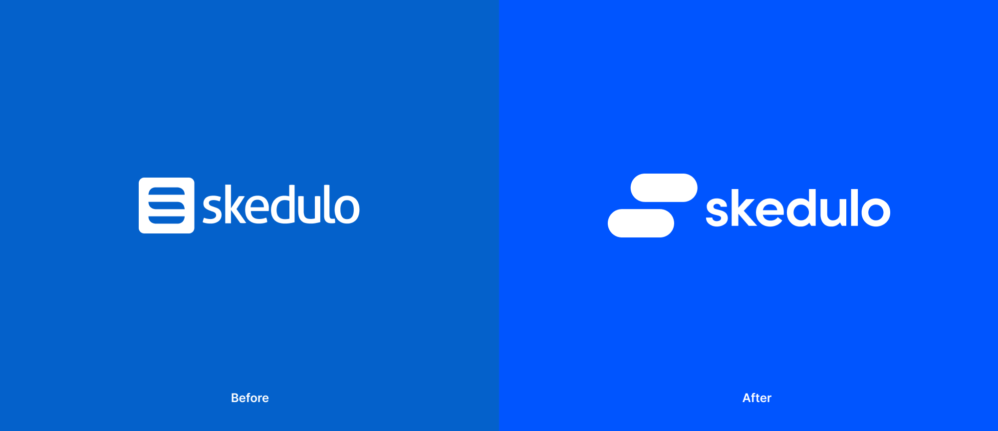
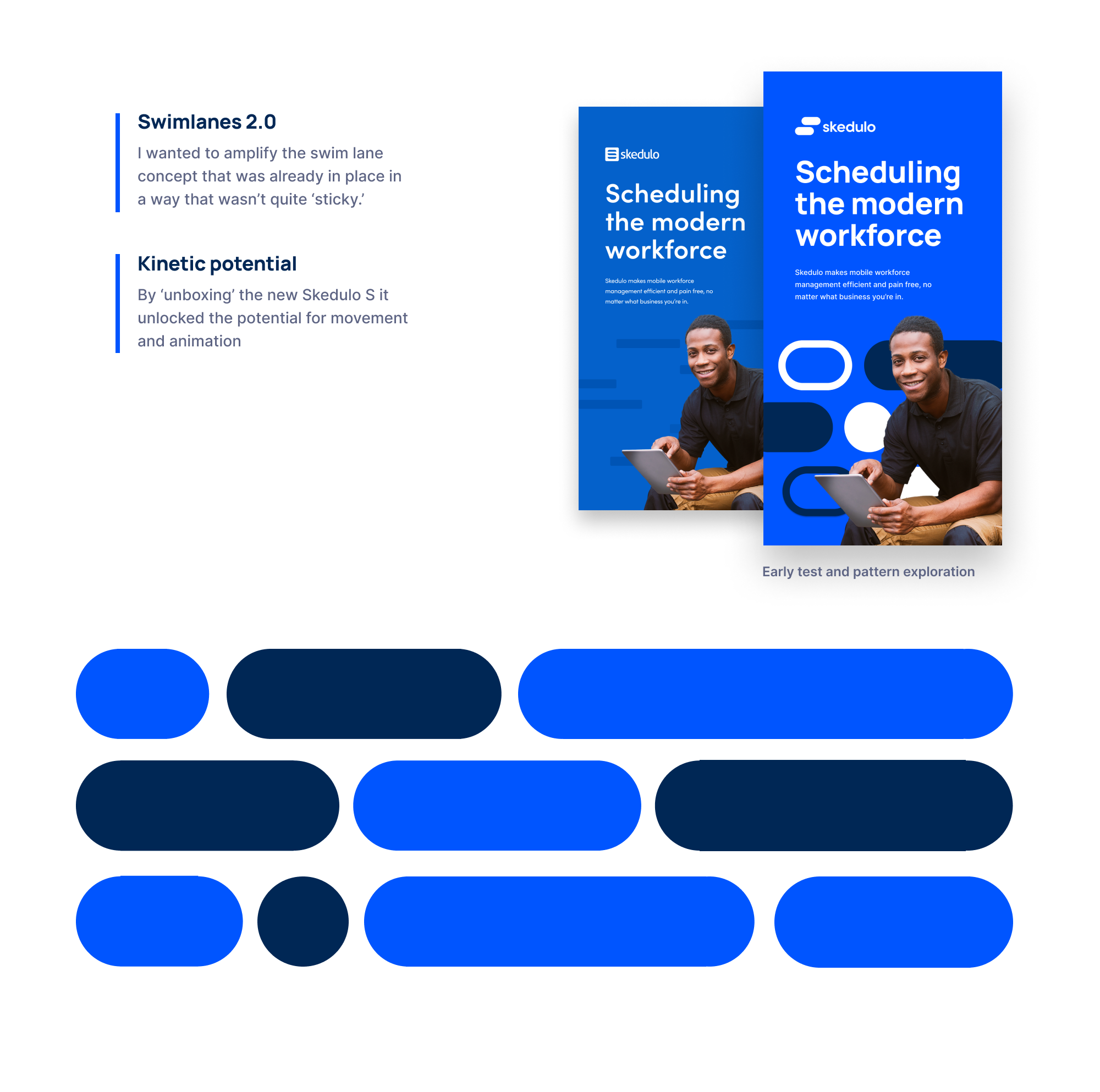
With our north star being digital-first, it only made sense to prioritize animation. The old Skedulo logo was an S made up of “swim lanes”—a feature of the product that gave users an easy-to-read view of their team’s schedule. This was a great concept that was executed quite subtly that I knew I wanted to amplify. A big step was figuring out how to effectively get the Skedulo S out of its cage and unlock its potential. Once we figured that out, the brand refresh really took flight—providing us with a graphic element that was recognizable yet highly flexible.
02. Color for screens
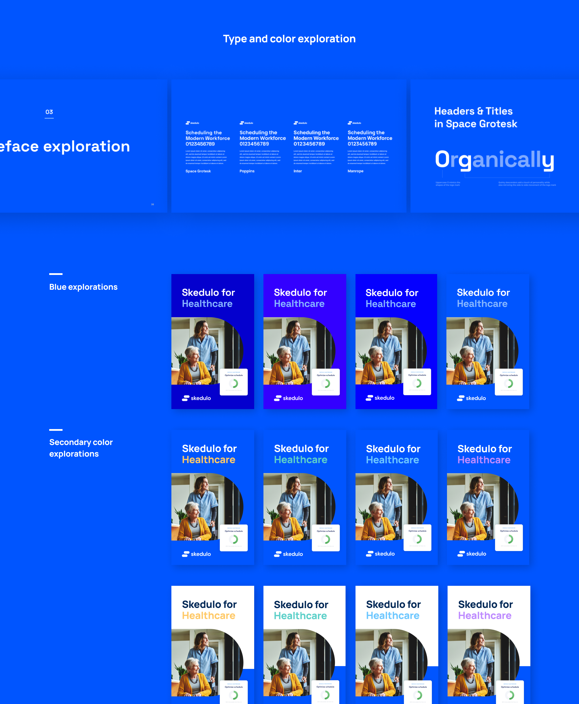
Obviously color is extremely important to a brand. For a retail giant like Target for example it’s paramount that they pick a color they can recreate consistently throughout their stores. For a digital first, B2B brand the considerations are slightly different. We picked a brand blue that had a bit a little more vibrance than what could be produced in print, opting to start our design exploration where our brand would mostly be seen—phones and computer screens—and then getting as close as we could in print, instead of the other way around.
03. Typography for scale
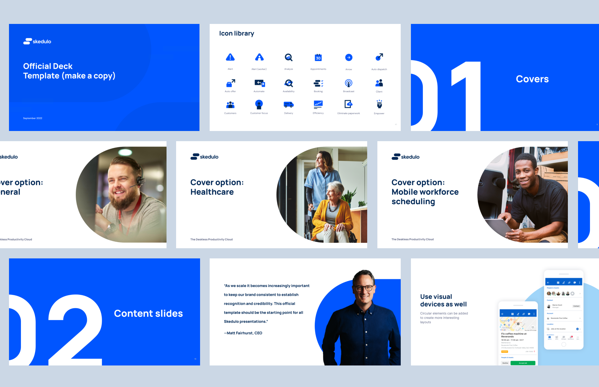
Much like color, a lot of incredible typefaces are optimized for print. Some unfortunately, with very complicated license agreements based on users or seats. I love expensive typefaces as much as the next designer, but again what’s most important here is context. Tech companies at certain stages of growth can be very fast-moving with small design teams. With brands, we can all agree that consistency is key—and with design teams being heavily prioritized, the reality is a lot of non-designers will have to make brand touch points like docs, slides, etc. Saying that, it becomes increasingly important to make decisions on type based on screen optimization, company distribution, and troubleshooting.
Brand is storytelling
At the end of the day, branding is less about design minutiae (although we pored through a lot of it) and more about telling a memorable story. One of the tent-pole projects we developed concurrently while working on the brand refresh is an overview video that both told the Skedulo story and hinted at the potential of the visual branding. This is just the tip of the iceberg and I can’t wait for what we do next.

